One clear ask.
Name the scope, decision authority and deadline. A missed response remains pending.
Design concepts to client decisions
Give the client an audience, criteria and a recommendation they can judge. Build the spoken argument, the written follow-up and an honest record of what remains unresolved.
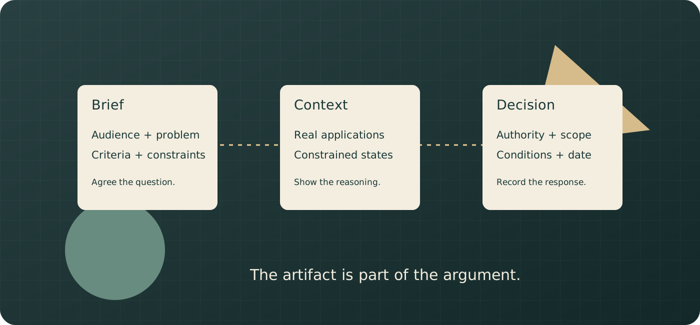
Name the scope, decision authority and deadline. A missed response remains pending.
Show real applications and constrained states. Keep the criterion beside the work.
The written record should make sense to somebody who was absent from the meeting.
record.The fictional Maple Bridge presentation is filled in: six stages, 35 outline minutes in a 45-minute slot, a named approver and a real feedback question. Edit the whole source and export what you need.
All dates, findings and outcomes are entered planning notes. The page does not verify client authority, send invitations, record signatures or infer approval from silence. Changing Review date only changes the deadline reminder.
PowerPoint includes every stage’s text, full speaker notes and supplied context image, plus decision and feedback records. Long material flows onto continuation slides. Written HTML is a self-contained narrative you can print through your browser; this tool does not generate PDF. JSON restores the complete editable source and images. Optional Save stores it in this browser; reset clears that saved copy.
Keep the original comment and its interpretation separate. Resolve the record deliberately after the appropriate people confirm the requirement.
The PowerPoint is a general editable slide draft produced by PptxGenJS 4.0.1, with notes and supplied raster images. It does not include Figma prototypes, live comments, animation, signatures or a remote presenter session. Inspect it in your actual presentation editor before sharing. HTML and Markdown retain the complete written argument and feedback. CSV contains all stage and feedback rows, plus project context; JSON is the exact restore format.
Upload a PNG, JPEG or WebP you can use. The page converts it to PNG and retains dimensions, original name and your credit. Image processing and exports happen in this page; there is no AI inference. If PowerPoint cannot load, its button is disabled while the genuine written/source exports remain available. Invalid dates or an incomplete Approved record clear derived output and disable exports while preserving source. Invalid imports are rejected without replacing a valid current packet.
This original 24-second silent animation follows the fictional Maple Bridge example through a corrected brief, contextual recommendation, a feedback requirement and explicit approval scope.
Start, pause or revisit any stage with the player controls. Captions and the complete written equivalent below carry the same explanation. There is no autoplay.
Agree the brief. Start with the corrected problem. Maple Bridge is a fictional example. Agree the audience and criteria before judging a visual direction.
Show the context. Show the recommendation in five relevant applications. Inspect the small-format and one-colour cases. A concept mockup is not proof of deployed performance.
Clarify the feedback. Ask which audience and application the concern affects. Keep the original comment and the agreed or provisional requirement, owner and unresolved question.
Record an explicit decision. A passed deadline does not approve the work. Record the human decision, date, scope and conditions explicitly. Direction approval is different from final artwork release.
A recommendation should reveal its reasons. A question should retain its uncertainty. A decision should name what was approved and what still needs work.
Restate the problem, establish the criteria, show a recommendation in realistic applications and ask an identified decision-maker for a specific response by an agreed date. Keep the reasoning in the document people receive afterwards. A beautiful deck helps communication; it does not settle authority, scope or disagreement by itself.
Choose the presentation tool that matches the evidence. Figma Design and Figma Slides suit a product flow already being designed there; Keynote suits a rehearsed presentation on supported Apple hardware; Canva suits collaborative deck production; Milanote suits image-led direction boards. A written PDF or another accessible fixed-version document can carry the argument afterwards. There is no evidence here that one brand reliably wins approvals or that every remote meeting fails in a particular tool.
Making work visible and presenting its reasoning are different jobs. A bare screenshot leaves readers to infer the audience, purpose and status. A live argument can resolve misunderstandings immediately. A self-contained written argument can also be effective asynchronously, including for people who need preparation time or cannot attend. The goal is to supply framing in the actual medium, rather than impose an absolute “never send anything before the meeting” rule.
The packet workbench supports that distinction. Its six-stage outline produces an editable PowerPoint with full speaker notes and a separate complete written HTML/Markdown narrative. Its feedback register keeps a comment, diagnostic question, agreed requirement, owner and resolution together. You enter the judgment; there is no sentiment model, automatic feedback interpretation or real client approval integration.
Write the audience, problem, constraints and requested change. “Modernize the brand” is a style request; “help procurement teams quickly understand our service and recognize our credentials” names a usable problem. Ask whether this restatement is correct before the design depends on it. If a material disagreement appears, resolve it rather than presenting an answer to the wrong problem.
Choose a few findings relevant to the decision. A sales-deck audit, a documented customer interview or a production constraint can explain the recommendation. Separate observations from interpretations. “Three interviewees asked for clearer certification information” is a scoped observation if you actually have the notes; “our buyers want trust” is an interpretation to discuss. Do not invent interviews, quotes or benchmark results to make the deck persuasive.
A useful principle can be checked in a context. Examples include a mark that remains identifiable at a 16-pixel browser-tab size; clear hierarchy when a document is printed in one colour; and readable real content on a narrow device. “Clean,” “modern” and “premium” need a functional explanation. Record the criterion, the evidence or test you need, and who accepts it.
Agreement is not a trap that prohibits later questions. A client can change priorities or notice a missing constraint; record the change and discuss its implications. Do not use an earlier nod as proof that a later concern is irrational. Different audiences, accessibility needs and production conditions may justify revisiting a principle.
Show enough applications to establish the system rather than touring every file. State what is being recommended, what is still exploratory and what is excluded from the decision. A product concept should include the flow and important states; an identity should include the actual formats the client uses. Show the constrained cases, not only flattering mockups.
If other directions informed the decision, summarize them and the reason each was rejected or retained. A recommendation plus two concise territory summaries is one useful structure when the strategy is largely settled. Two fully worked routes may be appropriate when there is an unresolved strategic choice the client actually owns. Do not treat a particular number of routes as an empirical law about what clients choose.
Do not offer an intentionally weak foil as a production option. If a route is clearly a research territory rather than available for selection, say so. If the client asks to reopen it, clarify what further work would be needed. An honest exploration can have value without pretending it is ready to make.
Name the exact decision, the responsible person, the deadline, the response channel and the downstream consequence. Distinguish “approve this direction” from “approve all final assets.” Ask whether any other person needs review before sign-off. Record conditions and unresolved requirements alongside the outcome.
In the workbench, changing the review date past the deadline shows that a response is overdue; it does not mark the concept Approved. Approval is an explicit entered record with a named approver, date and scope. The page cannot verify that person’s authority or create a binding agreement.
For a logo, show a relevant sign, business card, phone display, 16-pixel favicon and a one-colour application such as vinyl. For an identity system, use the client’s actual invoice, presentation template and packaging rather than unrelated luxury mockups. For a campaign, use the placements and dimensions they actually buy. A website needs real text lengths and an awkward long product name. A product interface needs populated, empty, loading and error states where they matter to the proposed flow.
These are examples of evidence to prepare, not universal tests that every identity must pass unchanged. A browser-tab icon may need a responsive variant; an app flow may need a prototype and separate behavior notes. Explain what a mockup demonstrates and what still needs production testing. A photograph of a sign is not a measurement of fabrication or sight distance.
Preserve the constraints in the follow-up narrative: size, content, colour limitations, material, state, audience and the question being evaluated. Include the source or credit for supplied images. Where you use a simulated application, label it as a concept mockup so the reader does not confuse it with deployed work.
The packet tool accepts one optional PNG, JPEG or WebP context image per stage. It converts the supplied raster into a PNG for a predictable PowerPoint export and keeps its name, dimensions and your caption/credit. It does not generate a design or prove legibility. The complete notes and narrative remain editable; an image should complement the argument rather than replace it.
A response such as “the blue feels cold” may identify a real audience mismatch, a production issue or an unfamiliar visual language. Start by asking what the work is failing to do, who the person imagines using it, which element causes the concern and whether the issue is functional or unfamiliar. Ask gently rather than implying that a client’s preference is uninformed.
Then restate the concern as a provisional requirement and ask for confirmation. For example: “We need the customer-service material to feel approachable while the procurement proposal remains formal—is that the distinction?” That is more actionable than changing every blue object immediately. Record whether the concern applies to the whole identity, one application or a particular audience.
Keep the original comment as well as your interpretation. It lets people check that the requirement was agreed rather than silently translated. When the comment is genuinely ambiguous, record an unanswered question and an owner. Do not label it resolved just because the designer has an explanation.
| Comment | Diagnostic question | Possible agreed requirement | Evidence to inspect |
|---|---|---|---|
| “It feels cold.” | Which audience and application should feel more welcoming? | Make the customer-service leaflet approachable while preserving clear procurement hierarchy | Actual leaflet copy, imagery and service contact state |
| “Make the mark bigger.” | Where is it failing to be recognized or read? | Use a simplified small-format variant if the current mark loses definition | 16-pixel icon, invoice header and low-resolution reproduction |
| “This is too plain.” | Which message or distinction is missing? | Make the product benefit prominent without reducing information clarity | Sales slide with actual content and a comparison against the agreed brief |
| “Use both directions.” | Which strategic attribute does each contribute? | Decide whether the shared attribute can fit one coherent system or needs another exploration | Named criteria, production effort and representative applications |
These are fictional diagnostic examples, not machine classifications. A requirement is agreed only after the appropriate people confirm it. One client representative can collect comments and flag contradictions; they may still need help from stakeholders to resolve priorities. A designer should not infer which senior person has final authority from the loudest comment.
Before the meeting, identify who recommends, who consolidates feedback, who approves and who can veto or require additional review. One named approver can simplify a routine direction decision. A committee, regulated organization or joint venture may need several recorded decisions and a defined escalation path instead.
Set a real deadline with the response channel and the next step if no response arrives. For example: “Please send a consolidated direction decision by 17:00 on 11 November. If it is still pending, the next production milestone will be reviewed with you.” Silence is not an approval record. If a project has separately negotiated contractual acceptance terms, the responsible parties need to understand them; this worksheet does not invent or enforce those terms.
Record what is approved: direction, palette exploration, prototype behavior, finished asset or production release. A concept approval with conditions is different from unconditional final artwork approval. Keep the version and conditions in the written record, and check changes against that scope. A celebratory email or an emoji reaction is not a clear description of the decision.
Agree revision scope and rounds at kickoff. Two included concept rounds and an additional paid round can be an illustrative commercial arrangement, not a universal industry standard. Define what counts as a round, what a correction includes, how new strategic work is handled and who authorizes additional effort. Report remaining agreed work without surprising the client with a fee.
The tool accepts Pending, Approved, Changes requested or Deferred as entered outcomes. Approved requires an approver, decision date and scope. It does not resolve open feedback automatically. Review reminders identify unnamed ownership, unresolved feedback, a past deadline and a missing ask. They are explicit rules applied to your fields, not a numerical quality score or a prediction of approval likelihood.
Maple Bridge supplies facilities-management services. Its eight-week identity project runs 6 October–27 November 2026. The concept presentation is in week five, on 3 November, with three stakeholders: Lina, marketing director and direction approver; Evan, founder and strategic reviewer; and Noor, account manager who consolidates feedback. The agreed decision deadline is 11 November. These names, findings and dates are fictional demonstration inputs.
The written request says “modernize the brand.” The designer proposes a clearer brief: help procurement teams recognize dependable service and quickly find the evidence needed to shortlist the supplier. Lina changes “enterprise buyers” to “procurement teams,” and the presentation uses the corrected wording. That edit is retained rather than hidden behind a vague “brief approved” checkbox.
Three fictional findings guide the recommendation: the current sales deck buries certification details; two illustrative customer-call notes emphasize dependable response rather than novelty; and partner websites often reproduce the mark at low resolution. Do not reuse these as evidence about a real client. Substitute actual research and link the sources before making a business recommendation.
The four principles are concrete:
The recommended Clear service route uses an open geometric mark, a restrained navy/green palette and strong information hierarchy. Show it on a browser tab, business card, entrance sign, sales-slide template and one-colour vinyl. Those are five applications, with ten minutes reserved for the context demonstration rather than an exhaustive artifact tour.
Two other territories appear in concise form. Expressive signal explored brighter colours and a more animated mark but did not serve the production constraints of partner reproduction. Heritage badge suggested longevity but added detail that did not survive the small-format test. They explain the exploration; they are not disguised options to select without further development.
When Evan says “cold,” Noor records the original comment. The designer asks whether the concern applies to procurement materials or the service touchpoint. Evan clarifies that he is imagining a worried caller. The agreed follow-up is to test warmer photography and friendlier written service copy on the contact leaflet, while Lina retains the procurement hierarchy principle. This is a concrete conditional resolution, not a promise that every objection disappears after one question.
| Stage | Minutes | Actual content / requested check |
|---|---|---|
| Restated brief | 5 | Procurement audience and corrected problem statement |
| What we learned | 4 | Three illustrative findings, each labeled as demonstration evidence |
| Principles | 4 | Four specific criteria and the context needed to inspect them |
| Recommendation | 10 | Clear service in the five named applications |
| Other territories | 4 | Expressive signal and Heritage badge, each with its rejection reason |
| Ask and scope | 8 | Lina’s direction decision by 11 November, conditions and follow-up ownership |
The outline totals 35 minutes. In a 45-minute slot, 10 minutes remain for discussion. If the recommendation segment becomes 18 minutes, the outline totals 43 and leaves only two minutes. Make that tradeoff visible before the meeting; do not assume a universal two-thirds rule guarantees enough discussion.
The workbench starts with all six stages, the actual written findings, four principles, route/context notes, decision request and the Evan/Noor feedback record. It is the filled example, not a separate generic preset. Its status remains Pending. To rehearse an outcome, explicitly enter Approved, Lina, 10 November 2026 and the scope “Clear service direction, subject to the contact-leaflet test.” The tool records your demonstration; it does not imply that a real client has signed anything.
A fictional follow-up message can say: “Thank you for reviewing Clear service. We are seeking direction approval, not final production artwork approval. Lina will send the consolidated response by 11 November. Noor will confirm the contact-leaflet requirement; the next round will test service copy and photography. The attached narrative includes the brief, findings, criteria, route and excluded territories.” This is complete written copy to adapt, not merely a template title.
Official public documentation and prices below were checked on 6 October 2026. These are supported capabilities and conditional choices, not tests of meeting reliability, client satisfaction or approval success. Access and regional billing can change; inspect the actual viewer route before a high-stakes meeting.
| Tool / artifact | Useful mechanism for this job | Important decision or limit |
|---|---|---|
| Storyflow | References, directions and rationale beside one another on a creative canvas | Useful before choosing a recommendation. Do not assume it supplies a full slide-deck, prototype or recorded approval workflow from those capabilities |
| Figma Design + Slides | Prototype context, slide presentation, presenter notes, live interaction and defined file permissions | Check audience/prototype permissions and login requirements; preload an offline slide deck with the documented restrictions |
| Keynote | Presenter notes, native slide composition, transitions, export and shared presentations | Apple apps plus supported browser collaboration extend beyond Mac-only use; sharing settings determine whether accounts are needed |
| Canva | Fullscreen/presenter/recording modes, shared decks and comment/edit/view access | Share the audience window; inspect what the chosen link exposes and whether a reviewer must log in to respond |
| Milanote | Composed visual boards, fullscreen presentation, focus on cards and read-only links | Good for reference-led discussion; board presentation is different from an interactive product prototype or a controlled approval record |
| PDF / written leave-behind | Fixed-version layout with explanatory prose, scope, sources and the ask | PDF can be annotated or edited in software; it is not intrinsically immutable, universally identical or a live prototype |
The current workspace combines reference images, writing and AI-supported board development. That can help compare directions with their reasons before one becomes the recommendation. The current page’s context description differs from the original’s older Tactic/document limits, so this guide does not repeat a stale exact attachment count. A canvas is not evidence of a slide master, a client-ready deck export or an authoritative approval state. Creative workspace.
Its pricing page distinguishes paid standalone early access, free invited collaboration and an announced future standalone Free plan. Listed monthly equivalents billed annually are $7.99 Plus, $14 Pro and $39 Max; this does not establish that every free route is available today. Treat the board as preparation material and provide a deliberate narrative/sharing handoff for the meeting. Storyflow pricing.
Figma Design lets a reviewer inspect the interaction rather than infer it from screenshots. Figma Slides adds actual presentation controls and notes. The current official workflow creates separate presenter and audience windows, supports co-presenter spotlight and can preload a deck for offline use. Keep the preloaded presenter tab open; embedded prototypes and YouTube videos cannot be interacted with offline. These specifics are more useful than an unsupported claim that Figma is always unreliable over video. Present a slide deck.
Audience access to interactive slides and embedded prototypes requires the applicable view permissions. A presentation-link audience must log in; simply sharing the audience window over a call does not require every viewer to access the deck. Viewer/comment roles are different from paid authoring seats. Current Professional annual pricing lists Full $16/month and Collab $3/month; the Collab seat covers Slides and FigJam, while Full includes Design. Do not buy Full seats for every reviewer just because a design file exists. Sharing and seats, pricing.
Slides can export PDF and PowerPoint, subject to owner restrictions and documented format limitations. Check the actual exported font, layout, embedded behavior and notes rather than assuming interactive content survives conversion. Retain a reviewed static narrative for recipients who cannot use the prototype. Export from Figma Slides.
Keynote supports native presentation, notes and transitions; Magic Move can explain a relationship between successive compositions when it serves the argument. It is available beyond Mac, including iPad/iPhone and supported iCloud browser collaboration on Windows. Current collaboration allows invited access or anyone-with-link access, with view-only or editing privileges. Anyone-with-link can open without an Apple Account under the documented settings; confidential material needs appropriately restricted sharing. Keynote also has comments, so a blanket “no comments” comparison is inaccurate. Collaboration and permissions, collaboration introduction.
The basic apps remain free; optional Apple Creator Studio adds premium content and intelligence features at the retrieved US price of $12.99/month or $129/year. That subscription is not required merely to make a basic Keynote deck. Presenter notes and exported documents are different audience artifacts; decide what recipients should see and inspect the final file. Apple Creator Studio terms and free-app distinction, presenter notes.
Current presentation modes include fullscreen, presenter view with separate audience/notes windows, recording and autoplay. Share the audience view when using a video call. Link access can allow viewing, commenting or editing; a comment-only link can expose existing comments without login, while adding or replying requires login. Official help warns that some public sharing can expose hidden/cropped content or presenter notes. Test the actual recipient route and remove material that should not be shared. Presentation modes, sharing via links.
The retrieved US pricing lists Free, Pro $144/year for one person and Business $250/year per person, with Business approvals/team administration and larger Brand Kit capacity. Free currently lists a limited three-colour Brand Kit, so “Brand Kit means Pro” is too broad. Choose based on required assets, administration, permissions and billing; templates are starting points to adapt rather than proof of poor craft. Canva pricing.
Its documented presentation mode hides editing tools, goes fullscreen and can focus on selected cards. Settings can hide comments and prevent accidental edits. That is an actual board presentation mechanism, even though it is not a conventional slide master or interactive product prototype. Read-only sharing can open without a Milanote account; permissions, password and comment settings deserve a recipient check. Presentation mode, sharing a board, read-only settings.
Current Free permits 100 notes/images/links and ten file uploads. Individual unlimited is $9.99/month billed annually on the retrieved plans page. It exports PDF Standard/Large, PNG, Word, Markdown and plain text; uploaded-file export has separate handling. Choose a board for spatial comparison, then add the structured narrative recipients need. A 100-item limit is a concrete capacity question, not proof that every project outgrows it. Plans, exporting work.
Use a fixed version with the brief, evidence, principles, recommendation, constraints, other territories and decision ask in readable prose. Add meaningful headings, image descriptions and links. Check the actual recipient device, font rendering, selectable text and any accessibility requirements. PDF is widely supported, but annotation/editing capabilities, font substitution, viewer differences and static interaction limits still matter.
Printed boards can help a room inspect actual size, materials or side-by-side directions. They do not automatically outperform a deck; supply the same criteria and decision scope. A self-contained accessible narrative may be HTML or another agreed format instead of PDF. The workbench exports written HTML and Markdown, plus a genuine editable PowerPoint; it does not claim to generate PDF or preserve live prototype behavior.
Using the retrieved annual US figures, one Professional Figma Full seat plus two Collab seats is $22/month equivalent, or $264/year. Free viewers are different from those authoring roles. Three Canva Business seats at $250 each are $750/year; three hypothetical separate Pro individual subscriptions would total $432/year, but are not an interchangeable team-administration package. Milanote’s listed individual annual equivalent is $119.88/year. Twelve Creator Studio monthly payments are $155.88, versus $129 annually, a $26.88 difference before tax; a basic Keynote deck may require neither payment.
Prices do not measure creative quality. Compare ownership, review access, exports, support, region, tax and commitment alongside the amount. Nothing in these documents establishes a brand uptime ranking or that buying a paid plan produces better approval decisions.
Rehearse the actual display, sharing permissions and fallback before the call. Share the audience window rather than your private notes. A shortened, focused remote argument can help, but “shorten by one third” is an optional rehearsal target rather than an empirical attention law. Preserve enough time to inspect the design and discuss concerns.
Give people a deliberate moment after the recommendation. A five-second quiet pause can be useful if agreed with the meeting flow; do not assume silence always means agreement or discomfort. Invite reactions through speech, chat or another accessible route. Camera use can be optional: privacy, disability, bandwidth or organizational policy may make a camera-on request unsuitable.
Provide a contextual pre-read when the audience needs it, labeled with the decision and questions. For live sequencing, share the screen and explain why you will walk through the argument. Send the complete narrative and updated decision record promptly afterwards. If a prototype cannot load, use reviewed static states and describe the missing interaction; a PDF is not a substitute for actually testing behavior.
Four common presentation patterns are worth rehearsing:
If somebody joins without context, ask what they know, summarize the brief and clarify their role before continuing. A short recalibration may be enough; a new approver or materially different brief can require more than thirty seconds. A senior title does not automatically establish authority over every decision.
If a committee cannot approve the whole concept, ask for the smaller decisions the next step depends on: the intended audience, the primary information, an accepted criterion or a scope boundary. Record each response and identify who resolves any remaining disagreement. This is progress towards a decision, not a way to manufacture approval from partial agreement.
Ask who else needs to review the work before sign-off. If the person with veto power is absent, record a pending review, provide the full narrative and adjust the schedule. Do not label the room’s enthusiasm as final approval. Consolidated feedback is useful because it exposes conflicting priorities; it must still preserve substantive objections rather than erase them.
Evaluate a tool’s trustworthiness through its actual viewer workflow, exports, access controls, support and terms. An old brand, a large user count or a marketing endorsement is not measured reliability. Figma’s current offline slide mechanism, Keynote’s actual collaboration permissions, Canva’s audience window and Milanote’s read-only focus mode are specific features to test. The understated improvement may be an owned decision record and complete written argument rather than another subscription.
Assign trust to a specific task. Figma can carry the design and prototype context; Keynote can carry a rehearsed slide argument; Canva can support shared deck production; Milanote can arrange visual references; a reviewed written document can carry the explanation afterwards. Test the actual audience permissions, notes window, export and recovery route. This guide has no measured brand trust ranking, and a familiar logo does not prove that a reviewer can open your chosen link.
Compare the roles and features you actually need. A free viewer is different from a paid authoring seat, and basic Keynote use is different from an optional premium subscription. The pricing comparison above shows actual seat arithmetic; include storage, team administration, billing commitment and export needs before treating two plans as equivalent. Start with the available workflow and add a paid role only when a required feature is missing. Check current official terms before purchasing.
There is no uptime or comparative meeting-reliability study here. Rehearse your actual deck on the presenting device and connection. Figma Slides documents offline preloading: wait for the available-offline indicator and keep the presenter tab open; embedded prototypes and YouTube interactions remain unavailable offline. Keep a reviewed fallback and explain any behavior it cannot demonstrate. Verify the audience window does not expose private notes.
First test the tools you already have with the evidence you need to show. A product-flow decision may need a prototype, while an identity review may need actual-size or one-colour applications. Use the Maple Bridge rehearsal: present the five applications, confirm the thirty-five-minute outline fits the slot, and open the full follow-up narrative as a recipient. Identify the missing capability before buying another subscription; software cannot supply an absent decision-maker or resolve an unagreed brief.
A complete written narrative often serves an absent stakeholder better than exported slides with no explanation. Printed boards can help inspect material, scale or adjacent routes when those qualities matter. Milanote's presentation mode can focus selected cards, hide comments and prevent accidental editing during a reference-led discussion. These are practical options to test, not claims that one medium guarantees approval.
The original article names Mindmap, Story Plan, Marketing Campaign, Brand Strategy, Storyboard and Second Brain templates. Adapt their structure to a real presentation decision. The entries below are fictional working examples for the same eight-week Maple Bridge project, not customer research or an extra tool feature.
Match the evidence and audience: Figma Design/Slides for design and interaction context, Keynote for rehearsed Apple-device presentation, Canva for collaborative decks, Milanote for reference-led boards and a readable fixed-version narrative for follow-up. Check the actual access and export requirements rather than a universal ranking.
One worked recommendation with concise other-territory reasoning is useful when strategy is settled. Two genuinely different worked routes can fit an open strategic choice. Avoid weak foils and make clear which directions are production options versus research territories. No route count guarantees the client’s choice.
A contextual pre-read can help preparation, accessibility or asynchronous review. Explain the problem, criteria, status and decision instead of forwarding unexplained screenshots. When the live argument needs sequencing, agree that approach. Send a complete narrative and decision record afterwards; “never before” is too absolute.
Ask what it fails to do, for whom, in which application and which element creates the concern. Preserve the original comment, restate a provisional requirement and obtain confirmation. Do not assume every objection is unfamiliarity or treat a defence as a resolution.
Context reveals scale, content, production limits and behavior. Use relevant formats and constrained cases, such as a small icon, one-colour application, long product name or empty/error state. Label mockups and distinguish demonstration from measured production performance.
Restate the problem, show relevant supported findings and agree practical criteria. If the brief is materially disputed, resolve it before continuing. Criteria can change when a missing constraint emerges; agreement is not a prohibition on later questions.
Identify the actual decision authority, feedback consolidator and any additional review or veto role. A routine direction may have one approver; a committee may need several scoped decisions. Record the deadline and response route. Silence does not become approval in this workbench.
Do not offer a weak foil as an available production choice. A clearly labeled exploratory territory can explain the reasoning, including why it was rejected and what reopening it would require. Be honest about what is viable and what you are recommending.
Test screen sharing, show the audience window, preserve discussion time and use a readable fallback. Provide accessible response routes and contextual pre-reading where helpful. Figma Slides has documented offline presentation with limits; a blanket claim that it is always unreliable is unsupported.
Agree scope, what counts as a round, corrections, new strategic work and authorization of additional effort. Two included rounds with a paid third is one possible arrangement, not a universal standard. Communicate usage and changes before surprising a client with a fee.
Showing exposes the artifact. Presenting supplies an audience, problem, criteria, reasoning and decision request. A live presentation can resolve questions immediately; a complete asynchronous narrative can also do that framing. Choose the medium that fits the audience.
Nominate a consolidator who preserves comments and identifies conflicting priorities. Ask the appropriate stakeholders to resolve the conflict or name the decision still open. Record an agreed requirement, owner and evidence for closure instead of silently choosing whichever comment is louder.
Show them when they help explain the recommendation, with a clear reason and status. One concise summary per territory may be enough. Do not present them as ready options unless they are genuinely supported and you are prepared to develop them.
Include the brief, findings and sources, principles, recommendation in context, rejected/open territories, actual status, scope, conditions and the decision ask. Use enough prose for somebody absent from the meeting. Check sharing permissions and remove private presenter material before sending.
Ask for a specific scoped response from identified authority by an agreed deadline, with consolidated questions and a consequence if the schedule changes. Preserve unresolved issues and follow up. An unanswered deadline stays pending; a worksheet cannot verify authority or guarantee approval.
State the concept’s status plainly and identify limitations where they affect the requested decision. Avoid repeated vague apologies, but do not pretend placeholder content or unresolved production constraints are finished. Separate direction approval from final artifact release.
Allocate enough time for evidence, context and discussion inside the actual slot. The fictional outline is 35 minutes in a 45-minute meeting, leaving ten minutes. Edit the allocations and rehearse. A fixed ratio is a planning suggestion rather than a guarantee.
Ask for the smaller decisions the work depends on and record who resolves the rest. Confirm audience, criteria and scope when whole-concept approval is unavailable. Do not treat partial agreement or an enthusiastic committee as authoritative sign-off.
Ask about their context and role, restate the relevant brief and clarify whether their participation changes approval requirements. A short recap may suffice; a new brief or approver can require a revised process. Record the consequence instead of carrying on blindly.
Check current official plan limits, viewing/comment rights, support, usable exports and actual billing commitments. Company age and marketing claims are not reliability measurements. A complete written narrative, a controlled PDF, Milanote focus mode or a precise decision register may help more than a new paid authoring seat.
No. PDF can be annotated or edited by appropriate software and is a static artifact with viewer differences. It is useful for a reviewed fixed-version narrative, but cannot preserve every prototype behavior. Inspect the actual reader experience and provide another accessible format where needed.